This is a problem discussed during the class Data Visualization. I found this problem interesting and hope to present the two solutions that I came up with.
Motivation
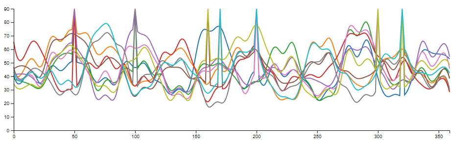
Spaghetti plot is usually referred to a line chart design with a huge amount of lines. In this case, all the lines tend to cover each other, which make it barely possible to identify each line, not to mention the corresponding value at a given data point.
A typical spaghetti plot consists of three data channels:
- A set of measurements or classes. (N) This is represented by lines in the spaghetti plot. The measurements or classes are usually categorically, but they can be ordinal under some cases (e.g. temperature of different years).
- A range of measurements. (M) This is represented by the x-axis. The measurements can be continues or discrete, even categorical. However, in practice, we can not measure a continues range under most cases, thus, there is a finite number of measurement within the range.
- The value at all the measurements within the range. This value can be continues or discrete, but usually none-categorical.
The are two general solution for spaghetti plot:
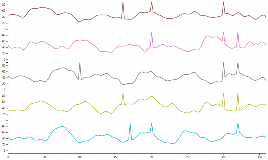
- Small Multiples: Separate lines into different charts. This design reuses the position encoding on the x-axis and/or the y-axis for different measurements or classes. It’s helpful to support a few dozens of measurements or classes, however, when N gets larger, it’s more and more difficult to compare different measurements or classes.
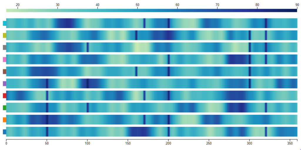
- Use color encoding for value: Encode measurements or classes on the y-axis and encode value on the color channel. This solution works better on high measurement or class number compared with small multiples. But due to the limitation of low distinguishability between colors, it’s hard to tell the exact value of a data point without other supporting methods, like interaction.
The purpose here is to find another solution that works better for a proposed task.
Dataset
I have found a dataset online describing the GDP of different nations since 1960. https://data.worldbank.org/indicator/NY.GDP.MKTP.CD?end=2017&start=1960&view=chartThis dataset involve all the countries in the world (268) and covers a period over 70 years. So, this dataset fits into the defined case:
- The number of “lines” (N) is the number of countries (268).
- The number of samples of each line (M) is 77.
- The range of the values is between 8 × 10⁷ and 8 × 10¹³.
I used this dataset for both of my designs. But the designs themselves can also be implemented for other datasets.
Designs
Design 1
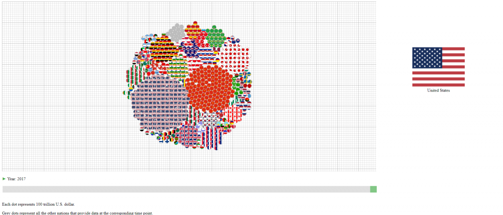
The first design encodes the year into data change during animation. So, it should work on the similar type of datasets as long the samples (M) is the time.
Encoding
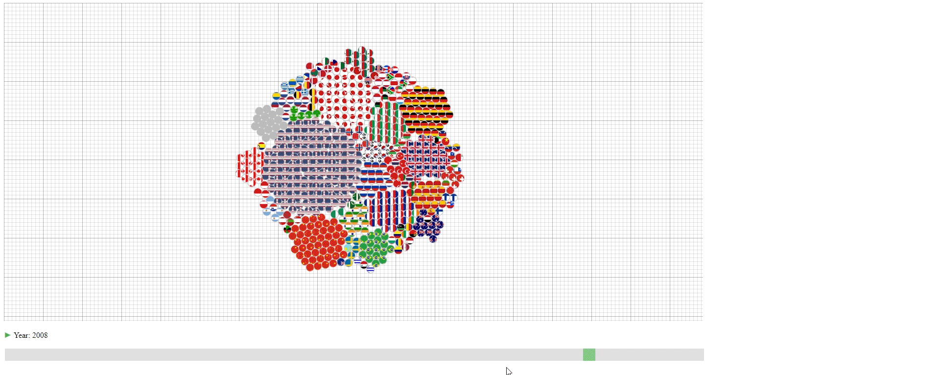
- The countries (N) are represented by their national flags.
- The years (M) are represented by the slider at the bottom and shown as the change of the graph.
- The GDPs (values) are represented by the number of circles in the graph with each circle representing 100 trillion U.S. dollar. The countries with less than 50 trillion U.S. dollar GDP are encoded together in the grey circles.
Animation & Interation
- The design has an animation that starts automatically to show the change of GDPs over the years. This animation can be paused and continued using the button at the bottom left.
- The user can drag the slider at the bottom to slide to the desired year.
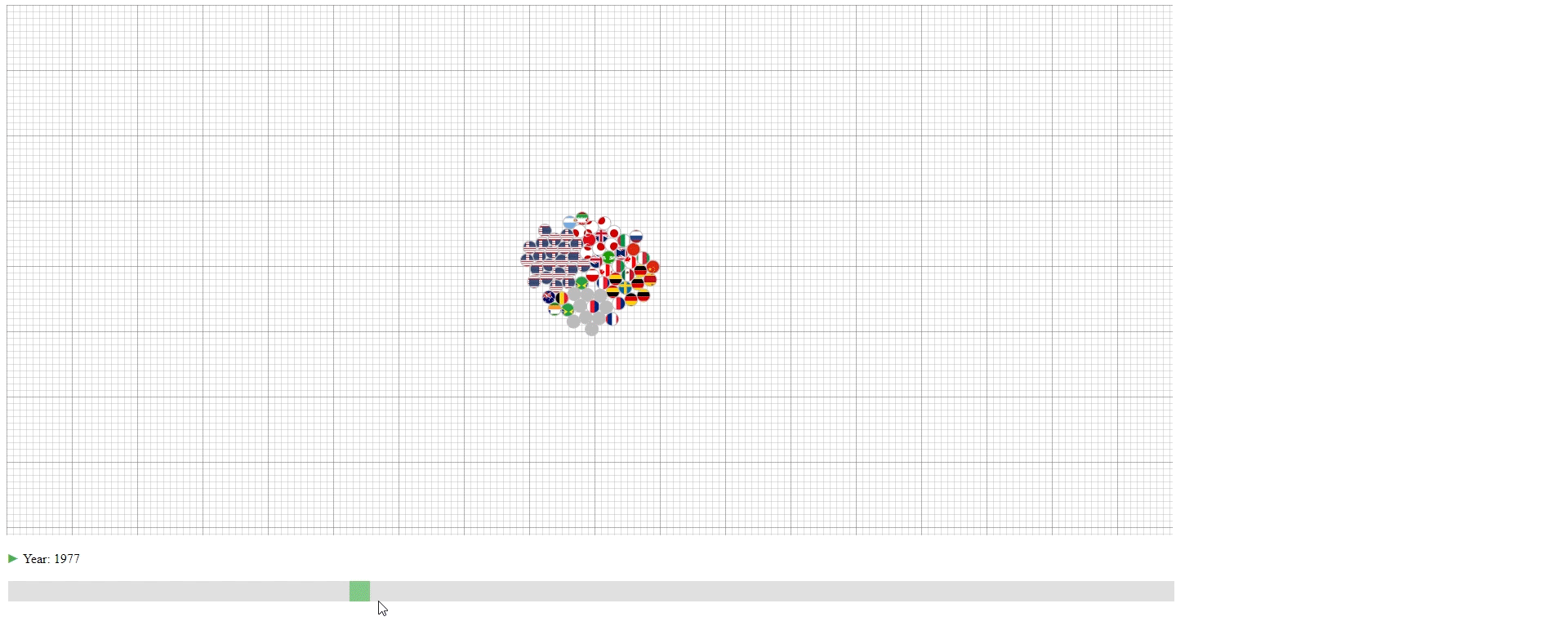
- Hovering over the circle to see the name of the country that a circle belongs to.
This design has three purposes:
- To show the approximate value (GDP) of each line (Country).
- To show the lines (countries) that have the top values (GDPs) among all the lines.
- To show the portion of each line (country) in the sum of values (GDPs).
However, the design also has some limitations:
- The value is not accurate with an accuracy of around 100 trillion U.S. dollar.
- If one wishes to know the values (GDPs) of lines (countries) with small values (GDPs), it’s not possible.
- It’s not easy to compare the values (GDPs) of a line (country) between two samples (years) due to the animation effect.
- It’s not easy to compare the values (GDPs) between to lines (countries) that have similar values (GDPs) unless counting the exact number of circles.
- The animation of a sample (year) takes a long time to finish when the values (GDPs) are large, and it’s really computational ineffective to build the visual result.
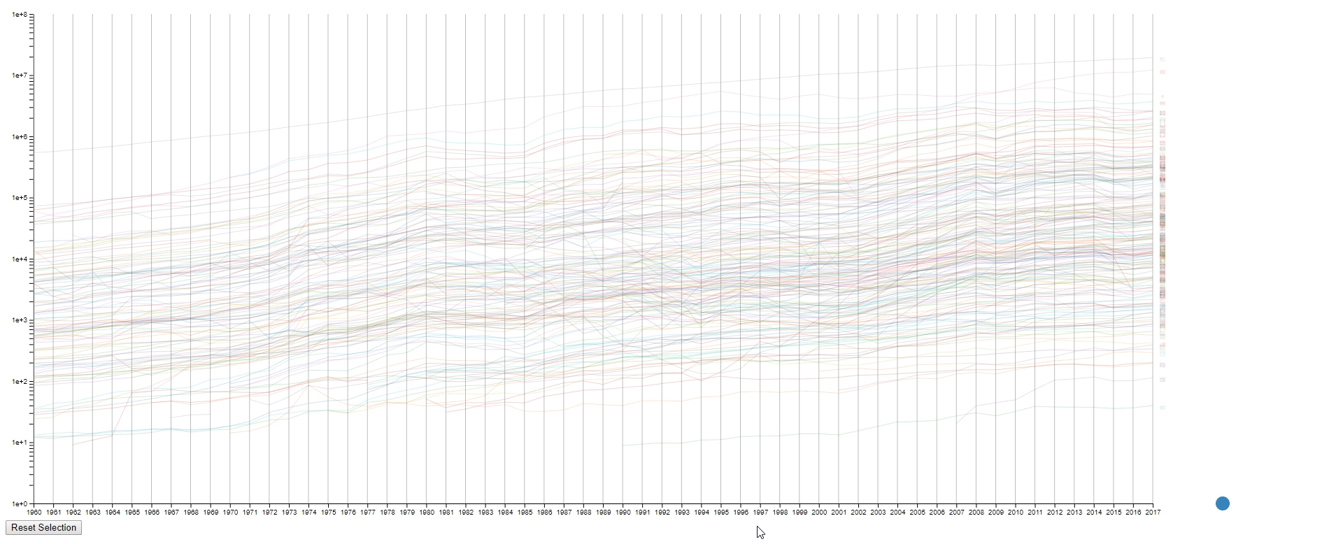
Design 2
The second design is an enhanced spaghetti plot with a few interactions enabled. The purpose of this design is to help to identify lines with similar values or values changes. This design should work on other datasets with no problem.
Encoding
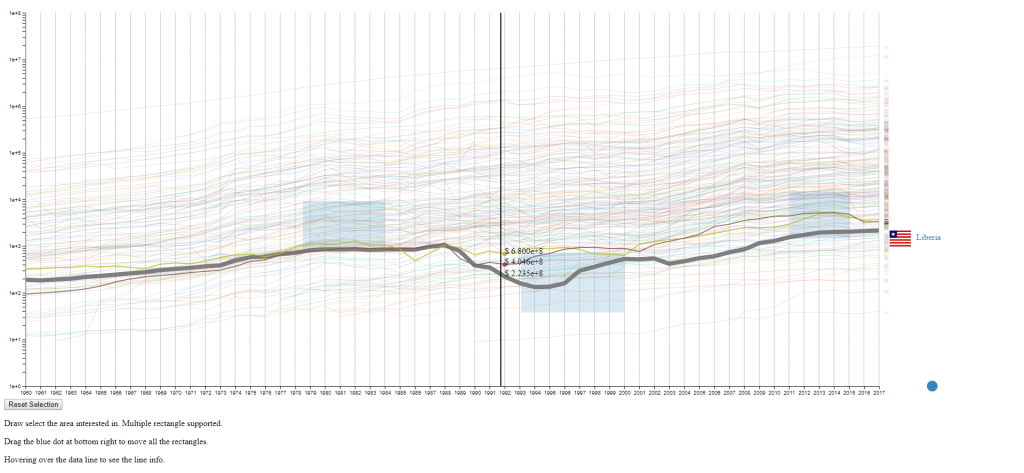
- The countries (N) are represented by the color of lines and the national flags at the right of the plot. The flag can be seen clearly by hovering over the line.
- The years (M) are encoded on the x-axis as common spaghetti plot.
- The GDPS (values) are encoded on the y-axis as common spaghetti plot.
Interation
- Draw rectangles using the mouse in the canvas area to select lines. The user may draw more than one rectangle at a time, and only the lines that fit into all the rectangles will be highlighted.
- Move all the rectangles by dragging the blue dot at the bottom right.
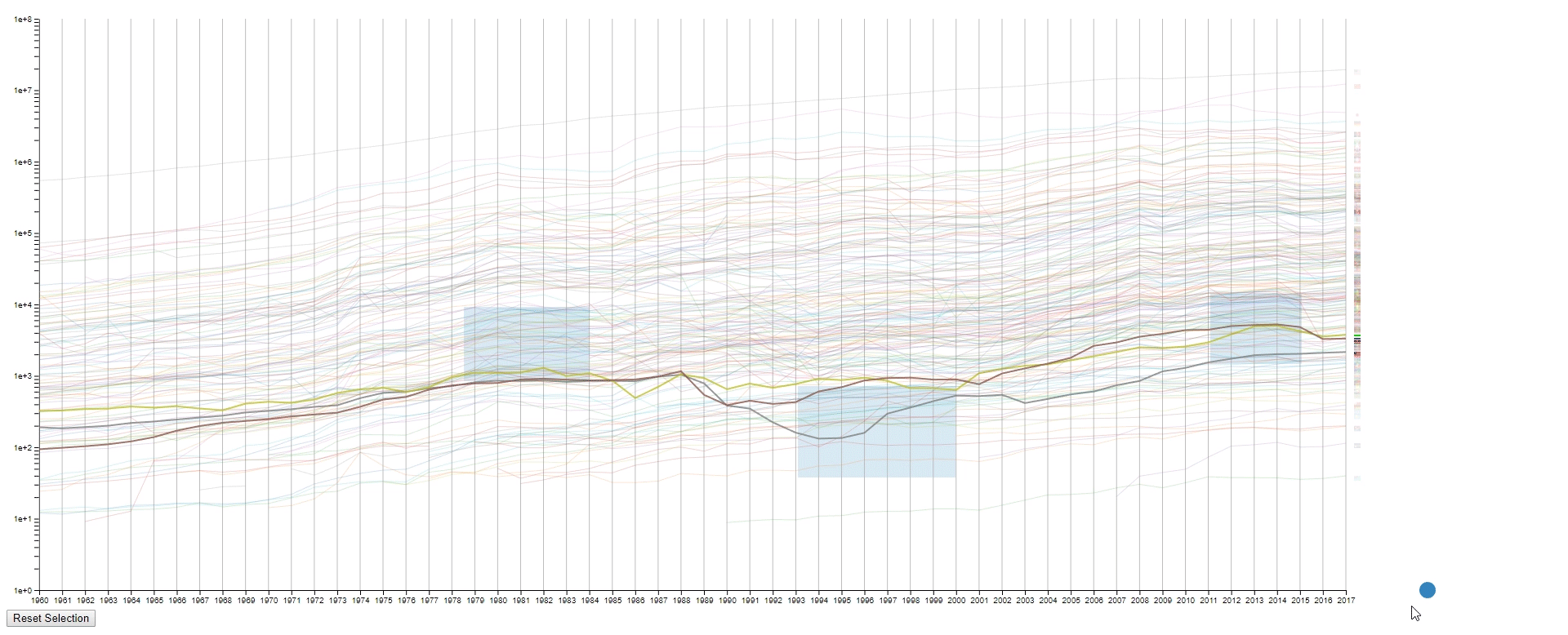
- Clear all the rectangles by clicking the button at the bottom left.
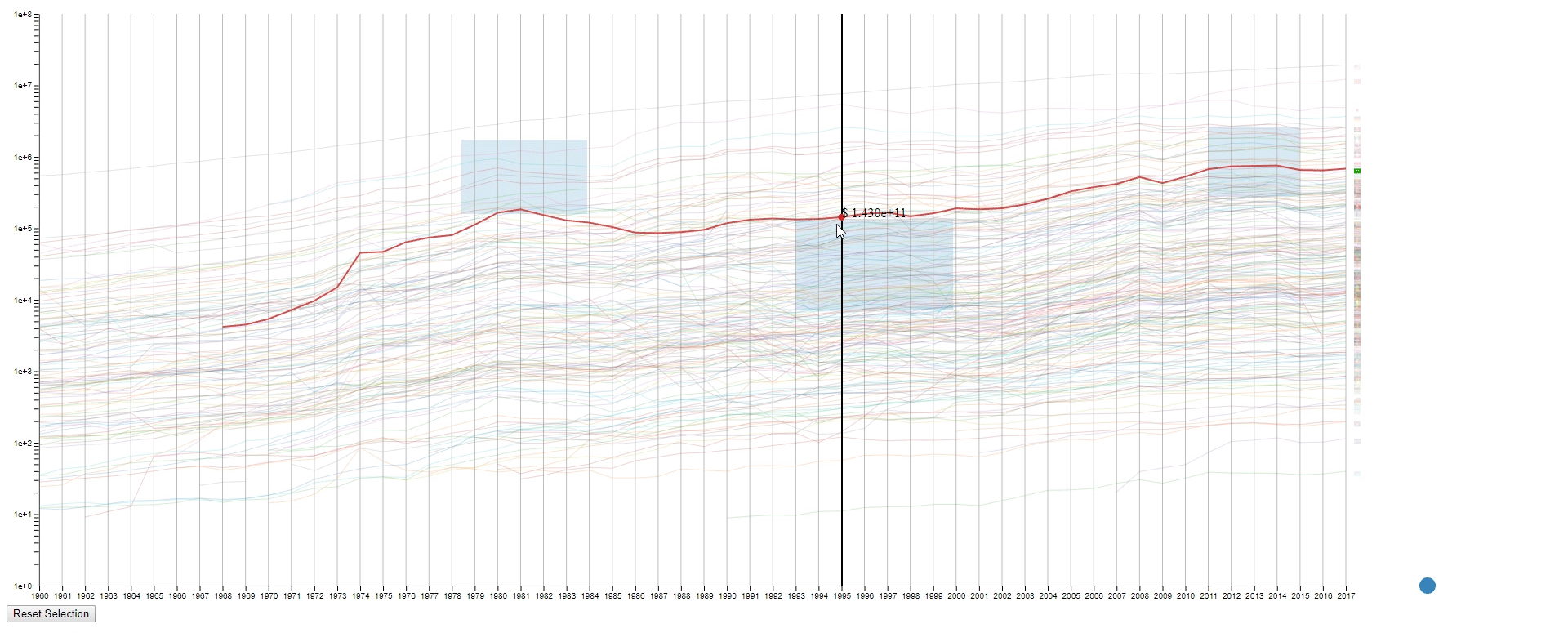
- Move the mouse across the canvas to see the GDPs of selected countries at the given year.
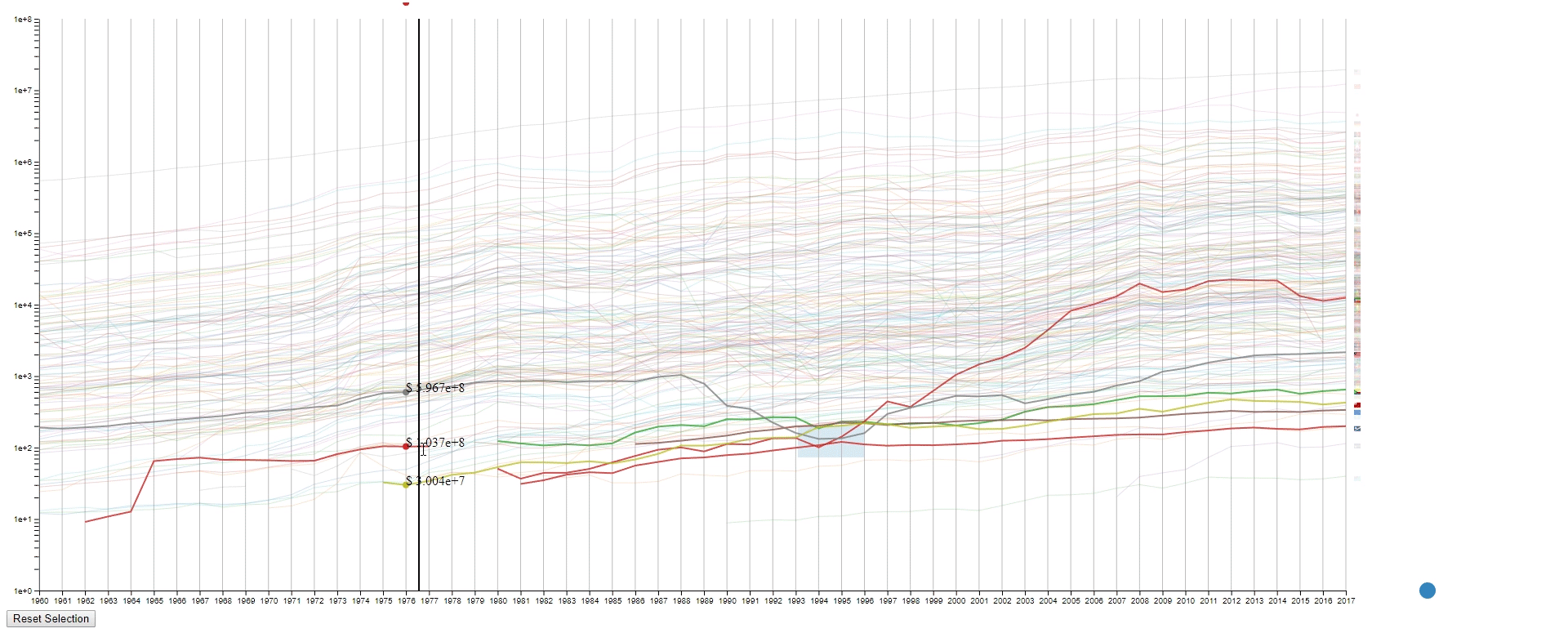
- Hover the mouse over a selected line to see the details of the country that it belongs to.
Design Critique
This design has four purposes:
- To find lines (countries) with similar values (GDPs) at a sample (year) range. This is achieved by using rectangles to select lines.
- To find lines (countries) with the desired change pattern over samples (years). This is achieved by drawing multiple rectangles.
- To find lines (countries) with similar change patterns over samples (years). This is achieved by moving rectangles using the blue dot.
- To get a relatively accurate value (GDP) of a line (country) at a sample point (year).
However, the design also has some limitations:
- It’s a spaghetti plot still, so it looks messy at the first impression.
- It’s hard to compare if too many lines (countries) are selected. In this case, it’s still a spaghetti plot.
- It’s impossible to select two lines (countries) that are far away without selecting the lines (countries) in between at the same time.
- The line (country) encoding is not efficient as the user are required to hover to know the info of the selected line (country).
- The design runs leggy at my computer, and I have no idea why it happens as I designed my code to be efficient during the interactions. It’s probably due to the inefficiency of javascript.
Reference
- DC3: Design Challenge 3. http://graphics.cs.wisc.edu/WP/vis18/dc3/
- D3: For building the visualization. https://github.com/d3/d3
- GDP (current US$) – THE WORLD BANK: The dataset used to design the visualization. https://data.worldbank.org/indicator/NY.GDP.MKTP.CD?end=2017&start=1960&view=chart
- flag-icon-
css : For thesvg flags. https://github.com/lipis/flag-icon-css - country-
iso -3-to-2: For translating the Alpha 3 country code to Alpha 2 country code. https://github.com/vtex/country-iso-3-to-2 - killercup/pandoc.css: For the index page style. https://gist.github.com/killercup/5917178